
A brand identity has to work beyond the logo
How to judge an identity in real use, choose useful applications and ask for a handover your team can work with.
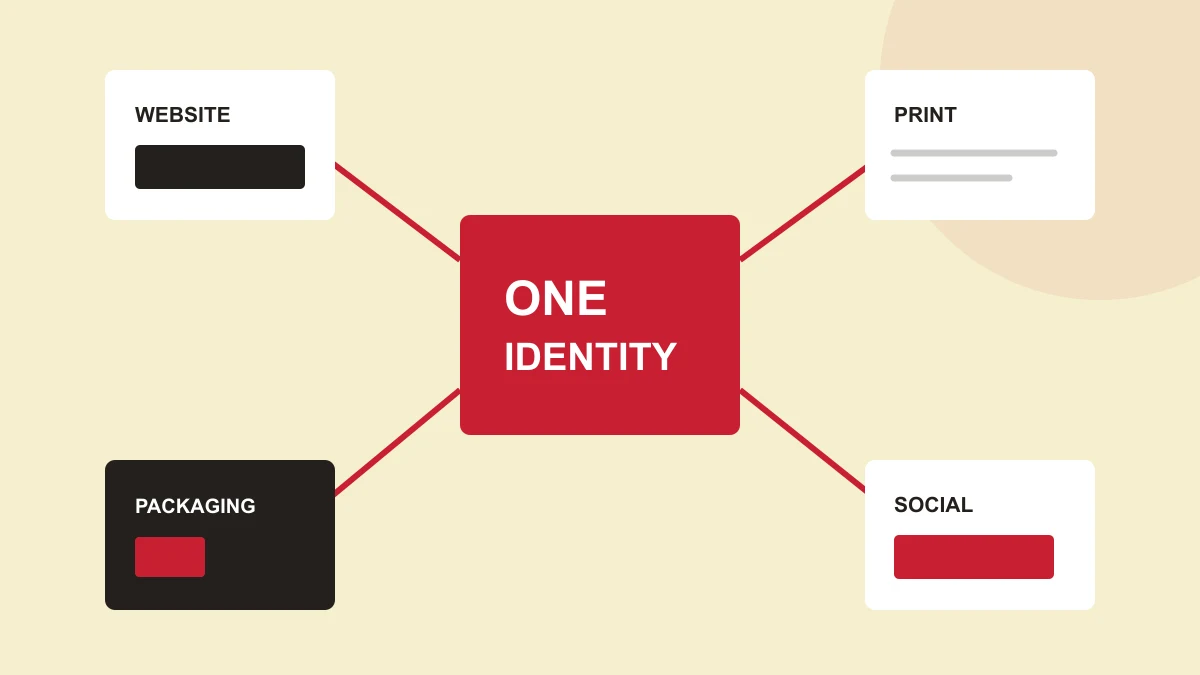
1. Treat the logo as the start of a system
A brand identity is the set of visual decisions that helps people recognize a business across different places. The logo is one part. Typography, colour, image choices, layout and the way those elements are applied give it consistency.
That consistency does not mean every item should look the same. A business card needs to make contact details easy to read. A product pack must establish the product and organize information. A website needs to help people navigate. The identity should connect those tasks without making the materials less useful.
2. Start with the materials people actually encounter
Before judging a logo presentation, list the applications the business needs. Prioritize the things customers see most often, including the less glamorous items: quotes, invoices, email signatures, forms and service documents. They are part of the impression too.
Scroll horizontally to compare all columns.
| Application | What to check |
|---|---|
| Website and mobile header | Is the logo clear at the size people will see? Does it leave enough space for navigation? |
| Social profile | Does an appropriate compact version fit the profile shape without cropping the mark? |
| Business card or letterhead | Are names, contact information and ordinary body text readable? |
| Packaging or signage | Can the important information be found at the intended viewing distance? |
| Email signature | Does the signature remain clear if images do not load or the screen is narrow? |
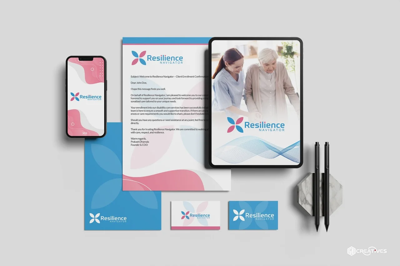
3. Make typography, colour and layout do useful work
Choose type roles rather than an ever-growing collection of fonts. Establish a heading treatment, a readable body style and a smaller supporting style. Test real names, longer service descriptions and the practical information that must fit. A polished short headline alone is not enough to judge the system.
Give colour a job. A strong brand colour can identify the business, while quieter surfaces give text and images room to work. Define suitable combinations for headings, small text, buttons and reversed logos. A colour that looks attractive as a large background may not be suitable for small lettering.
Layout rules also matter. Repeated spacing, alignment and information hierarchy make the materials feel related. The rules should be specific enough to guide future work but flexible enough to accommodate different amounts of content.

4. Agree the file handover before approving the identity
Ask which files you will receive and where each should be used. A vector master is useful for scaling and production; a raster export is useful in many everyday digital settings. Exact formats should reflect the applications and the tools your business uses.
Scroll horizontally to compare all columns.
| Handover item | Why it is useful |
|---|---|
| Primary and compact logo versions | Different spaces may require a full wordmark or a simpler mark. |
| Light and dark versions | A suitable reversed version avoids forcing a coloured logo onto an unsuitable background. |
| Colour references | Designers and suppliers need agreed references rather than colours sampled from screenshots. |
| Typography and licensing information | Your team needs to know the intended typefaces and any licensing responsibilities. |
| A few real layout examples | Examples of your own materials are easier to follow than abstract rules alone. |
Confirm who will hold the original files, what is included in the scope and who is responsible for any third-party licences. Do not assume a mockup image is the same thing as an editable design or production-ready artwork.
5. Check the identity in ordinary use
Review a small, realistic set of materials before calling the system finished. Include a mobile header, a social profile, a business card, an email signature and one application specific to your business. Use real content, not placeholder names and perfect-length headings.
- The mark remains recognizable at the intended size.
- Text remains readable in the proposed colour combinations.
- Spacing and alignment connect the materials.
- Long names and everyday content still fit.
- Your team knows which file to use and where to find it.
Use the worksheet to note what is working and what needs refinement. If one application fails, the answer may be a better variation or clearer usage guidance rather than a completely new identity.
A useful next step
Put the guide to work.
Download the plain-text worksheet, copy it into your preferred document editor and fill it in at your own pace. No email address required.
Download the brand consistency checklist